Are Chickpeas And Garbanzo Beans The Same Thing?
Learn the story behind chickpeas and garbanzo beans as we unwind the naming mystery, and explore their rich history and versatile culinary uses.
Read MoreLearn the story behind chickpeas and garbanzo beans as we unwind the naming mystery, and explore their rich history and versatile culinary uses.
Read MoreSeasoned travelers will tell you not to sleep on the 7-Eleven stores in Japan, where even the humble egg salad sandwich is a culinary treasure.
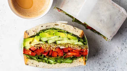
Read MoreNow's the time to nail down your sandwich wrapping skills with parchment paper. This is one simple way to fresher, more flavorful sammys wherever you go!
Read MoreSeasoned travelers will tell you not to sleep on the 7-Eleven stores in Japan, where even the humble egg salad sandwich is a culinary treasure.
Read MoreNow's the time to nail down your sandwich wrapping skills with parchment paper. This is one simple way to fresher, more flavorful sammys wherever you go!
Read MoreWe uncover the intriguing link between beer and cannabis smells. Learn why some brews emit skunky aromas and how it's tied to their ingredients.
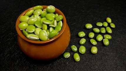
Read MoreFrom the canned goods aisle to your kitchen, the variety of beans can be overwhelming. Lima beans and edamame may look alike, but they're not the same.
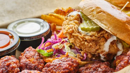
Read MoreDo you prefer crunchy or saucy? Nashville hot vs. buffalo chicken -- discover the fiery origins and flavorful differences between these spicy American staples!
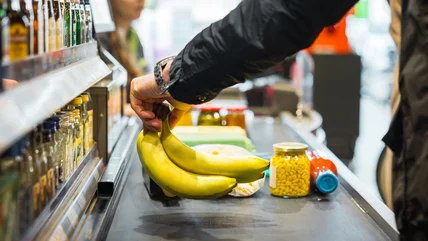
Read MoreBananas may just be the unsung heroes of the fruit world. Why are they always cheap, and what exactly are the factors that keep the prices stable?
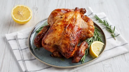
Read MoreRotisserie chicken is one of the most versatile grocery-items you can buy. Ready made, it can be added to a multitude of dishes. So, we put together 14 of them.
Read MoreDiscover the candy haven at b.a. Sweeties Candy Co., boasting North America's largest selection of sweets, rare treats, and endless soda options!
Read MoreExplore Starbucks' commitment to quality and sustainability with their exclusive use of premium Arabica beans, offering a distinct flavor in every cup.
Read MoreIt may seem like there's nothing to making an omelet. After speaking with an expert who gave us 15 mistakes everyone makes, it's clear there's much more to it.
Read MoreLearn the link between Aldi and Trader Joe's, from their similarly distinct shopping experiences to the question of ownership, given the long legacies of each.
Read MoreSee how you can rescue leftover pasta from the trash, and transform it into flavorful dishes with these tips for the best storage and reuse.
Read MoreHave you ever wondered why bananas steal the show in your fruit smoothies? It's all about esters! We reveal the science behind their potent aroma and flavor.
Read MoreThere's a certain kind of magic to Brooklyn-style pizza. See why a crispy-chewy crust, tangy sauce, and cheesy blend is distinct from a typical New York slice.
Read MoreDo you know the difference between a wet and dry cocktail shake? We divulge this, but also foam science, and which treatment James Bond's martini gets.
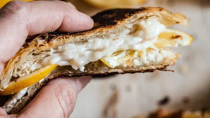
Read MoreTransform your sandwich game with flattened croissants. Crunchy on the outside, buttery on the inside - perfect for grilled cheese or savory fillings.
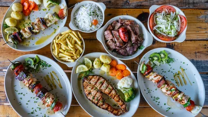
Read MorePortuguese cuisine is often overlooked but bursts with rich, decadent flavors. Our expert offers detailed culinary insights, having grown up on these dishes.
Read MoreWe unveil the (quite literal) allure of the Starbucks chain's timeless logo - and ... she's not a mermaid! Learn the truth, and history behind the mascot.
Read MoreStarbucks' new reusable cold cups, designed with 10-20% less plastic, are a step forward for sustainability, rewarding eco-conscious customers along the way.
Read MoreThere's a suitable plant-based protein out there for everyone; see how seitan and tempeh differ in terms of their texture, flavor, and nutrition.
Read MoreWe dish about London's Pick & Cheese, a rotating cheese bar at Seven Dials Market, where artisanal cheeses take center stage on a conveyor belt feast.
Read MoreTrader Joe's recalls Infinite Herbs Organic Basil due to potential salmonella contamination. Check for affected products and contact for refunds.
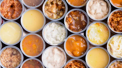
Read MoreUncover the surprising sodium content lurking in your favorite canned soups and how it impacts your health. Is it time to rethink your go-to comfort food?
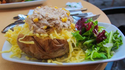
Read MoreExplore the unconventional twist on the classic baked potato with a hearty topping -- a mayo-rich tuna salad. It's. become quite the British favorite.
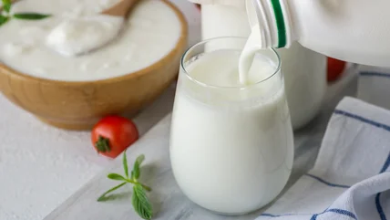
Read MoreLearn the secrets to preserving your leftover buttermilk: from freezing tips to homemade alternatives, ensuring every drop lasts deliciously.
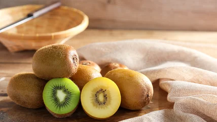
Read MoreJoin in the divisive kiwi debates: to peel or not to peel? Kiwi skins offer nutrients, but some find the fuzz unappetizing. Here's the scoop.
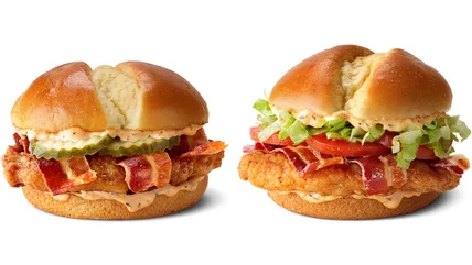
Read MoreMcDonald's introduces the Bacon Cajun Ranch McCrispy, a tantalizing twist on its iconic chicken sandwich lineup. Available soon at participating locations!
Read MoreBanish stubborn stains from your cookie sheets with a powerful duo: baking soda and hydrogen peroxide. Discover the chemistry behind their cleaning magic!
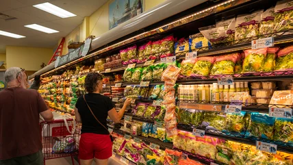
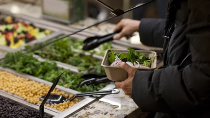
Read MoreGrocery stores repurpose produce for its salad bars, but should you be concerned? We dig into some of the safety standards surrounding of this practice.
Read More